Idea 1
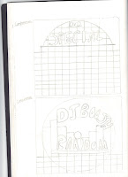
 This is my first idea and according to the audience feeback I have been given they think that this idea is the best out of all of the ideas that I have drawn below. The audience that I have got feedback from is the same target audience that DJ Boosh is aiming for with regards to it's album. The audience gave vital feedback about these designs saying that it should have plenty of colour and stand out. They also suggested using a black background for it as this will give off the best colour possible.
 This design is going to be 6 panel like all of the other designs. The reason why this is 6 panel is because I think that it is more organised and fun to have as a digipak. As you can see on the left on the inside panel I would have the 4 head shot that we use in our music videos on the inside as it would look good to have this as just one of the panels and the audience feedback agrees on this. What the target audience also like the idea of is the poster that they can stick on their walls as our target audience could be seen to have university students who like to put posters up on their walls.
This is the front cover and back cover for the digipak and the audience feedback that i got on this was that they really liked it as the liked the simpleness of it and the organisation of it. What they also really liked about this digipak is the USP which i have included on the front cover, this is to draw in the audience to buy the digipak as in some of the albums all around the UK tickets have been placed inside to see DJ Boosh live at the o2 arena. The audience think this is a really good idea and a very good idea in order to bring in more of an audience.
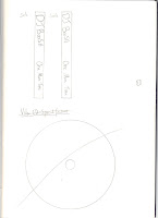
 These are the spines for my digipak and they are pretty much the same throughout all of the designs and the audience thought that these were quite good as they said that its simple and matches in with the rest of the digipak.
Idea 2
 Once again I have decided to go with the four face theme on the inside flap of the digipak as it is a good idea for the image on the inside flap. I have also stuck with the idea of having a poster as I think that this best suits the digipak and the ideas that I am trying to acheive. As I have already spoken about before the audience has given me feedback that this is a good idea and that should stick with this idea.
 As you can see here on the left I am showing how the CD's will be presented in the digipak. As you can see one will be shown in a wallett and the other will be shown the be in a sort of clicking contraction within the album.
 These are the spines for my digipak and they are pretty much the same throughout all of the designs and the audience thought that these were quite good as they said that its simple and matches in with the rest of the digipak.
Idea 3
 Once again I have decided to go with the four face theme on the inside flap of the digipak as it is a good idea for the image on the inside flap. I have also stuck with the idea of having a poster however this time I have changed it around so that the poster is on another panel and istead on this panel is a CD.
 As I have said above I have also stuck with the idea of having a poster as I think that this best suits the digipak and the ideas that I am trying to acheive. As I have already spoken about before the audience has given me feedback that this is a good idea and that should stick with this idea.
 These are the spines for my digipak and they are pretty much the same throughout all of the designs and the audience thought that these were quite good as they said that its simple and matches in with the rest of the digipak.
Idea 4

This looked like a good idea to me when I first started drawig it and even when I finished I thought it was really good idea that could be my main idea. However my target audience gave me some feedback which pointed out something very interesting about this idea and that it was only representing one song and this is an album and so it wouldn't work. I'm glad I got audience feedback as it means that I won't use this idea and isntead i'll use one of my other ideas.
 As you can see here on the left I am showing how the poster will be presented in the digipak. As you can see it will be shown in a wallett so that you can withdraw it with ease as well as put it back in with equal ease. Also on the left is my indise compartment and as you can see I have chose not to use the four face picture this time as I think there has to be atleast one design where im not using the four face design on the inside panel.
 These are the spines for my digipak and they are pretty much the same throughout all of the designs and the audience thought that these were quite good as they said that its simple and matches in with the rest of the digipak.
 As you can see here on the left I am showing how the CD's will be presented in the digipak. As you can see one will be shown in a wallett and the other will be shown the be in a sort of clicking contraction within the album.


No comments:
Post a Comment