Friday 12 April 2013

Music Video Evaluation


In what ways does your media product use, develop or challenge forms and conventions of real media products?

When looking at the codes and conventions of music videos and more precisely our music video, we can see that our music video is from the house party/dance genre and the way we can see this is through the ingredients (codes and conventions) that we have used. We as a group were aiming to create a video that is based purely on the genre of dance music and house party music and we have achieved this by following most of the codes and conventions of this specific genre – opening paragraph could have a picture (screenshot from the music video) of all of us.

The first sign that you get that we are following  (using) the codes and conventions of music videos is the dance routines that we have included within our video. We have at least 5 dance routines in our music video as you can see here (show some of the dance routines) and as you can see they are easy dance routines to do that can be done at parties and this is using the codes and conventions showing that this song is from the dance genre. Another way in which we have used and followed the codes and conventions of our genre is by the way that we have kept with the theme of having constant fun and maintaining a good atmosphere. This is a very important code and convention of the dance/ house party genre as without the fun it makes it boring and dancing isn’t meant to be boring, it’s meant to be energetic and exciting and that what we have accomplished in our music video.

The ways in which we have gone against or developed our genre of music is through the use of costume and randomness. With regards to the costumes we have gone against the traditional party clothes that you would wear in a dance/ house party video, instead we have opted for mocking other pop videos and in doing this we have made sure to wear the costumes from the music videos in order to take the ‘mick’ and by doing this we are going against he traditional codes and conventions of this genre. The ways in which we have developed the genre is the way in that we have gone about including dance routines within our music video. Our dance routines are a different style to the usual dance routines you would see in the dance/house party genre in a way that the typical dance routine would be something that reoccurs during the chorus of a song and shows a repeat of 3 or 4 moves that are easy to learn where as with our dance routine there about 5 or 6 dance routines that have been taken from different pop songs and mocked by us. Our dance routine doesn’t repeat in an order either like the genres conventions says it should, ours just keeps going and there’s no end.
 
When looking at the codes and conventions of a music video a theorist that you should consider is Andrew Goodwin who stated that there are a set of rules that music videos follow. The rules in which we follow was the inter textual reference rule. We followed this as we had references to other dance videos, such as the 'Cha Cha Slide', 'Can't Touch This' and 'The Macarena'. Another rule that we followed of Goodwin's theory was that there will be a relationship between the music and the visuals. We have used this in our video through the pace of the music as it matches on with the visuals as we have made sure that the visuals match this too. Another rule which is similar to this one which we have also followed is the lyrics have a relationship with the visuals, we have made sure to use this rule as well as we are constantly miming through out the music video. Finally we have also made sure to include genre characteristics much like i have talked about above, these are the codes and convetions of the genre. For our genre which is dance/house music, we have made sure to include plenty of dance routines in order to communciate the theme of our genre which is dance/house music.

What have you learned from your audience feedback?

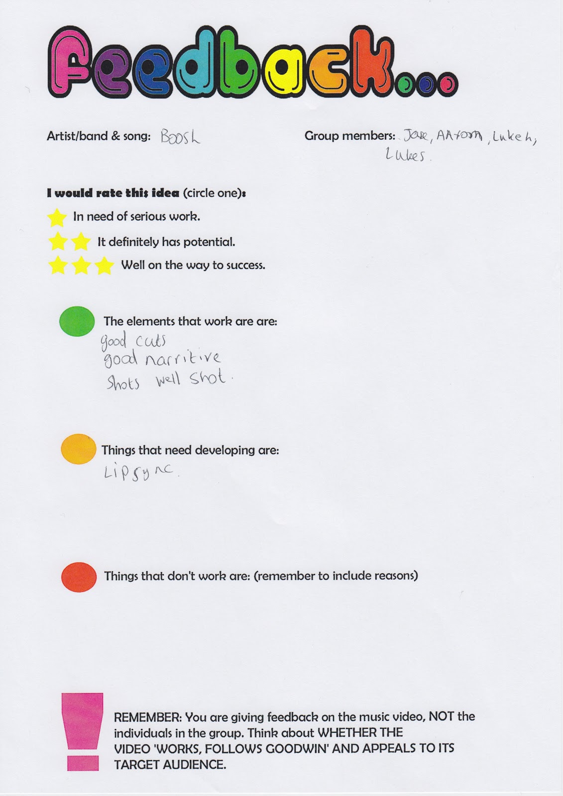
In order to receive feedback on my music video we as a group posted our video on Facebook requesting that they write their opinions on what they think of our music video. We received feedback from 4 people who are within our target audience bracket (18-25).  What was so good about this feedback was that it was a critique of our work, so there was comments of improvements that could be made and this is what helped us out as it pointed out things to us that we never noticed before with regards to our music video and things that we could do better or even change.

We was given one negative feedback which helped us out a lot as it gave us advice on what we could do better and listening to our target audience will be what will make our music video effective as our target audience is the one who wants to watch it so it’s best that we listen to their opinions as they are really the only ones that matter. The negative feedback that we were given wasn’t too negative it was more of an option to make it better if we wanted to as he quoted ‘needs a smoother ending though’. We as a group agreed on this and felt this needed to be changed, so we did edit the ending in order to make it smoother and it was based purely on the comment that this person wrote on Facebook.

There weren’t only negative comments there was also plenty of positive comments about our music video, some of which included things such as; ‘it was really funny’ and ‘I was laughing’. I think this is brilliant feedback as that is what we was aiming for and I’m glad that we made people laugh as now we know that we have accomplished one of our objectives. Another good set of comments that I got about this first draft of our music video is about the use of Goodwin’s theory and more specifically the use of inter textual referencing throughout the video as here were such comment as ‘I understood all of the inter-textual references and the worked well’ and loved the inter-textual references’. With regards to our music video it is like one big inter-textual reference as there is more than 5 of them within the video and for them to be noticed by our target audience is something that we know we have done well. Reading audience feedback like this from our target audience helps us understand what we have done right and what we have done wrong and the things that we have done wrong, we now we can improve on based on what our target audience thinks. What we have learnt is what our target audience thinks of our music video and what can be improved on the first draft on it on order to make the final draft the best it can possibly be. 


Thursday 28 March 2013

Feedback On Music Video


From these feedback sheets we can understand as a group that the things that need developing are;

  • Lip singing needs to be more synchronised with the song that is going on in the background.
  • The target audience should be suggested to be clubbers and why only male?
  • The pace of the music video doesn't match the sound, so needs to be changed slightly.
  • There should only be one parody per room.
  • The structure doesn't entirely make sense.
  • To adjust the pace of the video you could find a different edit of the song.
We as a group will now go trough each individual point that we have been given as audience feedback and we will make sure to develop these things so that they are better and so that it is suitable for the target audience.

Wednesday 27 March 2013

Audience Feedback


As you can see above we posted our music video on Facebook so that other people could comment and so that we could get feedback on how to improve our music video based on what our target audience thinks. We got some great responses saying how much they liked it and how they thought it was funny to watch. They also thought our use of Andrew Goodwins theory was worked into the video well as they commented on our use of inter-textual references. How the one thing that most said needed developing about this video was the ending as they said that it needed to finished in a more smoother way and now we as a group will look at ways of accomplishing this.

Sunday 17 March 2013

Feedback On Poster And Digipak

The feedback that i got on my Digipak and posters were;

  • The copyright needs to be removed from the poster as it doesn't need to be there.
  • Some of the less important things that are on the poster need to be down sized and more important things need to be made bigger.
  • The Digipak spines need to be added to the digipak.
  • The poster also needs to be made bigger on the digipak.
  • the bottom left panel image needs to have an effect added to it in order to make it more appealing and fun.
  • Aslo make the half CD bigger as it doesn't look right with regards to the ratio to the CD next to it.
As you can see I do not have many things that I need to correct so it shouldn't be too hard to make the necessary corrections that have been stated above. I will now make these correction and re-post my digipak and poster so that I can see the comparison between he two and how much better it looks.

Friday 15 March 2013

Journal Post 9

Poster Designs And Audience Feedback


Idea 1

With regards to this poster design I also got people to look at my poster designs to see what they thought of the designs. Once again I got the audience that I used to give me feedback on my digipak in order to give me feedback on these designs. The reason for me doing this is because I know that the people who I am asking are part of my target audience there for they can determine whether they think it's good or not and whether the poster would catch their eye or not. Another reason why I chose to use the same audience again is because then I can get an understanding of whether the combination of the two ancillary texts is effective. From my audience research I found out that this design was the best as it is basic but at the same time it does well in connoting my artist and album and it also links in well with the music video I have created as well as the digipak that I have designed.
Idea 2

With regards to this design the target audience that I asked said that this is not a good poster design as all it is doing is representing the music video that I have created where as the one above it connoting everything that I need it to. The bad thing about just representing my music video is that it isn't doing the right thing that this specific poster is suppose to do, what this poster is meant to do is promote and advertise the new digipak (album) that is being released, it is also meant to represent my artist and the genre of music that he produces. However what the target audience have disliked about this poster design is the fact that this doesn't accomplish it's objectives where as the one above does and so this is why I will be using the design above as the main design for my digipak.


Designs For Digipak And Audience Feedback

Idea 1

This is my first idea and according to the audience feeback I have been given they think that this idea is the best out of all of the ideas that I have drawn below. The audience that I have got feedback from is the same target audience that DJ Boosh is aiming for with regards to it's album. The audience gave vital feedback about these designs saying that it should have plenty of colour and stand out. They also suggested using a black background for it as this will give off the best colour possible.

This design is going to be 6 panel like all of the other designs. The reason why this is 6 panel is because I think that it is more organised and fun to have as a digipak. As you can see on the left on the inside panel I would have the 4 head shot that we use in our music videos on the inside as it would look good to have this as just one of the panels and the audience feedback agrees on this. What the target audience also like the idea of is the poster that they can stick on their walls as our target audience could be seen to have university students who like to put posters up on their walls.

This is the front cover and back cover for the digipak and the audience feedback that i got on this was that they really liked it as the liked the simpleness of it and the organisation of it. What they also really liked about this digipak is the USP which i have included on the front cover, this is to draw in the audience to buy the digipak as in some of the albums all around the UK tickets have been placed inside to see DJ Boosh live at the o2 arena. The audience think this is a really good idea and a very good idea in order to bring in more of an audience.
These are the spines for my digipak and they are pretty much the same throughout all of the designs and the audience thought that these were quite good as they said that its simple and matches in with the rest of the digipak.

Idea 2

I think this idea would be my back up idea if my first idea was to fail, the audience feed back that I got was that this was another good idea but that it would be too complicated to make and the audience thought that the background of the digipak would be to overwhelming and distract the viewers from the rest of the album. So for this reason I will be using this 2nd idea as my back up idea so that if my first idea fails then I will use this idea in order to make sure that I have that security.
Once again I have decided to go with the four face theme on the inside flap of the digipak as it is a good idea for the image on the inside flap. I have also stuck with the idea of having a poster as I think that this best suits the digipak and the ideas that I am trying to acheive. As I have already spoken about before the audience has given me feedback that this is a good idea and that  should stick with this idea.

As you can see here on the left I am showing how the CD's will be presented in the digipak. As you can see one will be shown in a wallett and the other will be shown the be in a sort of clicking contraction within the album.

These are the spines for my digipak and they are pretty much the same throughout all of the designs and the audience thought that these were quite good as they said that its simple and matches in with the rest of the digipak.


Idea 3
This looked like a good idea to me when I first started drawig it and even when I finished I thought it was really good idea that could be my main idea. However my target audience gave me some feedback which pointed out something very interesting about this idea and that it was only representing one song and this is an album and so it wouldn't work. I'm glad I got audience feedback as it means that I won't use this idea and isntead i'll use one of my other ideas.
Once again I have decided to go with the four face theme on the inside flap of the digipak as it is a good idea for the image on the inside flap. I have also stuck with the idea of having a poster however this time I have changed it around so that the poster is on another panel and istead on this panel is a CD.

As I have said above I have also stuck with the idea of having a poster as I think that this best suits the digipak and the ideas that I am trying to acheive. As I have already spoken about before the audience has given me feedback that this is a good idea and that should stick with this idea.

These are the spines for my digipak and they are pretty much the same throughout all of the designs and the audience thought that these were quite good as they said that its simple and matches in with the rest of the digipak.


Idea 4


This looked like a good idea to me when I first started drawig it and even when I finished I thought it was really good idea that could be my main idea. However my target audience gave me some feedback which pointed out something very interesting about this idea and that it was only representing one song and this is an album and so it wouldn't work. I'm glad I got audience feedback as it means that I won't use this idea and isntead i'll use one of my other ideas.

As you can see here on the left I am showing how the poster will be presented in the digipak. As you can see it will be shown in a wallett so that you can withdraw it with ease as well as put it back in with equal ease. Also on the left is my indise compartment and as you can see I have chose not to use the four face picture this time as I think there has to be atleast one design where im not using the four face design on the inside panel.
These are the spines for my digipak and they are pretty much the same throughout all of the designs and the audience thought that these were quite good as they said that its simple and matches in with the rest of the digipak.

As you can see here on the left I am showing how the CD's will be presented in the digipak. As you can see one will be shown in a wallett and the other will be shown the be in a sort of clicking contraction within the album.

Poster Analysis

Digipak Analysis


Sunday 27 January 2013

Costumes Left To Get

Now that we have filmed a few parts of our music video, I am going to keep up to date with what we have done and haven't so that I know how many more costumes that are still left to get so I have made a list of costumes below that we may or may not have but that we need to film.

Fast Food Song - For this the costumes will come from Ebay and they will consist of print design t-shirts of the 3 different fast food restaurants. We are still yet to film this one.

Cha Cha Slide - We have the costumes for this dance routine already which are denim tops, dark (black) t-shirts with random print designs on the t-shirt and baggy jeans. We are still yet to film this one.

The Ketchup Song - For this dance routine we need black dresses, so we will ask our mums if they have a dress we could use but if not then we will have to go to a shop and purchase these items of clothing. We are still yet to film this.

Cant Touch This - With regards to this dance routine I need to ask someone if we can borrow their Mc Hammer costume as they have the exact costume. With regards to the rest of us we will wear tight tank tops and tight trousers (both black). We are still yet to film this.

Gangnam Style - This is the final dance routine that we will be doing in our music video and the costumes for this one will be the most trickiest as there is going to be about 20-25 dancers so we are going to have to find a costume for each to wear them for the dance routine. We are still yet to film this one.

Saturday 26 January 2013

Filming 3/9 Parts Out Of Our Music Video

Last week we finally started filming as we managed to gather the costumes together some of our dance videos. The costumes we managed to get were for the dance videos; Queen - Bohemian Rhapsody, The Macarena and Justin Bieber - One Time. So these are the ones that we have filmed so far and with regards to organisation I have decided to split our production process into 9 parts, each part represents a dance video as well as our corridor scene. This way we can keep account of how many more parts we need to film. Now that we have filmed 3 parts of our music video we can move on to filming the other 6 parts; the corridor scene, Gangnam Style, Fast-food song, Ketchup song and Mc Hammer - Cant Touch This.

Also we as a group have made a decision to remove one of the dance routines from our music video, the dance routine is the Britney Spears song - Hit Me Baby One More Time. The reasons for us removing this video is because it is due to lack of resources for the costume as well as the time that we have in order to shoot our music video. However the main reasons why we have decided against filming this dance routine is that it would be too hard to shoot and wouldn't really fit in with the overall objective that we are trying to achieve for example this dance routine for the Britney Spears video would have had to be in a school corridor but our min guy is entering rooms, therefore he cannot enter a door into a corridor, it wouldn't work.

Thursday 24 January 2013

Editing Our First Piece Of Footage - Bohemian Rhapsody


Just above is an image of us editing the footage we have filmed. The footage is as you can see is our spoof version of the Queen music video Bohemian Rhapsody. We as a group decided that perhaps it would be better to shoot each person doing it individually and then add each of us in afterwards so that it looks better as you can see above. Our main editors Luke Shelley and Luke Hewitt will now match the miming to the music which will be a difficult job but nothing is impossible.


As you can see above we are able to move the heads around to position them how we want them to be positioned and this is good as we may need to move it around for quite a long time before we are happy with the final image.


This is how the final positioning will look, we may change this depending on how it looks within the final video but for now this is the final placement of our heads and as you can see we have done well to almost mirror Queens version of this so this is good for us.

Wednesday 23 January 2013

Blog Feedback

This is my blog feedback I have been given;


All in all I think my blog is getting better as each time it gets marked I have less things to do in order to make it better so this is a positive. However somethings I can make better are;

  • Dates need to be added to the posts
  • Gather more audience research, perhaps another music video analysis?
  • Add the storyboard to the blog with annotated lyrics and a brainstorm of ideas
  • Finally scan through my paper flat plans of my digipack

Tuesday 22 January 2013

Music Video Analysis - Psy (Gangnam Style)


  • The first thing we can establish from this music video is that it shows some links to Goodwins music video theory. For example the artist has a lot of close-ups of himself in the video and although Goodwin states that this is because the record company want plenty of exposure I think this doesn't apply to this video as the artist didn't expect his video to do this worldwide so I expect that the close-ups werent intenional with regards to getting him out to the audience but just for the video itself.
  • The only link that I can see with regards to Goodwins theory is that there is genre characteristics. For example if it was a rock video you would expect to see live music performances. So with regards to this music video, it is basically a pop/dance video and with these music videos you would expect to see a lot of dance routines which there is. There is a consistent dance routine that goes on throughout and this is a dance routine that we would hope to use in our music video. 
  • The costumes of this music video is very retro but modern at the same time. For example the main artist Psy is wearing a retro suit that is a big fashion statement but it looks good anyway as its just so random that it looks cool, it could be some sort of fashion back in Korea where he comes from so this could play a part. 
  • The camera angles and camera movements used throughout the video are excellent in the way the camera is always moving, always panning and tracking. However the final shot where everything has built up to this one moment and the camera movement and angles are spot on as the music video explodes and is just like 'wow'. I think these camera shots are good and we will be using these same shots in our music video in order to connote that we are making an intertextual reference of the Gangnam style video.
  • The dance routine is one of the most iconic dance routines I have ever seen and that is why I will be using it in my music video and we will also be using it as the final part of the video as it is the most iconic dance routine out of all the ones we have chosen.  
  • The locations of this video would be hard to find so this means that we will have to compromise by using a different location and we have found one that is big enough for us to film at least 25 to 30 people doing this dance routine.

Sunday 6 January 2013

Brief For DJ Boosh

Brief Overview

DJ Boosh is in need of a Digi-pak for his new single 'One More Time'. About the Artist: DJ Boosh is a fresh new artist who is all about the house/dance music. DJ Boosh AKA Jack Mitchell performs in local clubs as well as taking a break abroad in Ibiza where he made a name for himself working the decks out there. Watch some of his gigs here at: http://www.youtube.com/DJBoosh. Desired image look: Cool, party hardcore, dance and techno, crazy mind blowing fun and a real floor filler. Pictures can be found of DJ Boosh on his Facebook page 'Dj Boosh (Jack Mitchell)'. I would suggest not to include DJ Boosh in any of the images, he is the background guy and goes against all the connotations of music videos, especially pop which he hates. Go for the dance aspect of the artist. Go for the feel good, dance, techno, in your face visual styling. Use stand out bright colours mixed with the artists name DJ Boosh to catch the audiences attentions and make everyone remember that name not only as a party starter but also a dance floor filler legend and that name is... DJ Boosh.

Brand Name

DJ Boosh

Target Audience

This Digi-pak will be sold in stores to people all over the world, hoping that one day it will become that world wide hit that we want. The main objective will be reaching our primary target audience of 18-25 which is also both genders included. The purpose of this digi-pack will be to get DJ Boosh out there to the world and to secure gigs, venues, festivals and other such party functions. To share with the fans this party legend in the making.

Requirements

I need the following: (1) digi-pak cover; playing off the party/dance theme. We would like to divulge into the chaotic party and dance routine theme. For example as DJ Boosh wants to be kept out of the lime light of pictures, we thought 4 silhouettes of the male dancers that are included in the music video and then each of them are doing a different dance routine each in order to communicate that really party sensation. The cover should also include the artist name 'DJ Boosh' and the name of the digi-pak. The pack will be full of colour and will stick to a theme of 4 main colours, white, black, blue and another colour that suits well with those three. CD label: used directly on CD. Design should complement the front cover of the digi-pack and not over shadow it or even over whelm the viewer. The CD should follow in suit with the front cover by using the same themes whilst also have the artists name on the label as well as the name of the CD. Other information you may want to include on the label is perhaps the track name 'One More Time' or the website, www.DJBoosh.co.uk. These things are an optional add on to the digi-pak if not added on the label then they will exist some where else within the pack. Finally all of the artwork produced should be hi-res and should be able to print on large 30" posters). The artists must provide the original Adobe Illustrator, Photoshop files (with layers). Need these to be editable so we can change the track name or artist information if needs be.