
Friday 29 March 2013
Thursday 28 March 2013
Feedback On Music Video
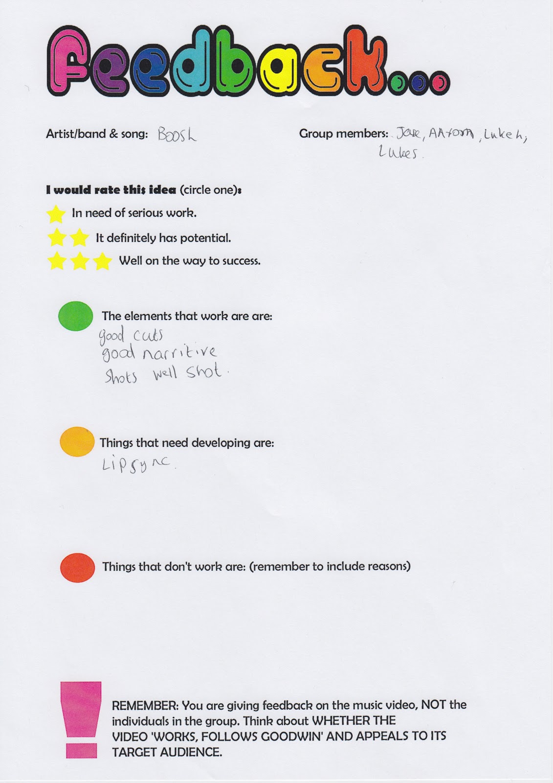


From these feedback sheets we can understand as a group that the things that need developing are;
- Lip singing needs to be more synchronised with the song that is going on in the background.
- The target audience should be suggested to be clubbers and why only male?
- The pace of the music video doesn't match the sound, so needs to be changed slightly.
- There should only be one parody per room.
- The structure doesn't entirely make sense.
- To adjust the pace of the video you could find a different edit of the song.
We as a group will now go trough each individual point that we have been given as audience feedback and we will make sure to develop these things so that they are better and so that it is suitable for the target audience.
Wednesday 27 March 2013
Audience Feedback

As you can see above we posted our music video on Facebook so that other people could comment and so that we could get feedback on how to improve our music video based on what our target audience thinks. We got some great responses saying how much they liked it and how they thought it was funny to watch. They also thought our use of Andrew Goodwins theory was worked into the video well as they commented on our use of inter-textual references. How the one thing that most said needed developing about this video was the ending as they said that it needed to finished in a more smoother way and now we as a group will look at ways of accomplishing this.
Tuesday 26 March 2013
Wednesday 20 March 2013
Tuesday 19 March 2013
Monday 18 March 2013
Sunday 17 March 2013
Feedback On Poster And Digipak
The feedback that i got on my Digipak and posters were;
- The copyright needs to be removed from the poster as it doesn't need to be there.
- Some of the less important things that are on the poster need to be down sized and more important things need to be made bigger.
- The Digipak spines need to be added to the digipak.
- The poster also needs to be made bigger on the digipak.
- the bottom left panel image needs to have an effect added to it in order to make it more appealing and fun.
- Aslo make the half CD bigger as it doesn't look right with regards to the ratio to the CD next to it.
As you can see I do not have many things that I need to correct so it shouldn't be too hard to make the necessary corrections that have been stated above. I will now make these correction and re-post my digipak and poster so that I can see the comparison between he two and how much better it looks.
Saturday 16 March 2013


Friday 15 March 2013
Poster Designs And Audience Feedback
Idea 1
 With regards to this poster design I also got people to look at my poster designs to see what they thought of the designs. Once again I got the audience that I used to give me feedback on my digipak in order to give me feedback on these designs. The reason for me doing this is because I know that the people who I am asking are part of my target audience there for they can determine whether they think it's good or not and whether the poster would catch their eye or not. Another reason why I chose to use the same audience again is because then I can get an understanding of whether the combination of the two ancillary texts is effective. From my audience research I found out that this design was the best as it is basic but at the same time it does well in connoting my artist and album and it also links in well with the music video I have created as well as the digipak that I have designed.
Idea 2
 With regards to this design the target audience that I asked said that this is not a good poster design as all it is doing is representing the music video that I have created where as the one above it connoting everything that I need it to. The bad thing about just representing my music video is that it isn't doing the right thing that this specific poster is suppose to do, what this poster is meant to do is promote and advertise the new digipak (album) that is being released, it is also meant to represent my artist and the genre of music that he produces. However what the target audience have disliked about this poster design is the fact that this doesn't accomplish it's objectives where as the one above does and so this is why I will be using the design above as the main design for my digipak.
Designs For Digipak And Audience Feedback
Idea 1
 This is my first idea and according to the audience feeback I have been given they think that this idea is the best out of all of the ideas that I have drawn below. The audience that I have got feedback from is the same target audience that DJ Boosh is aiming for with regards to it's album. The audience gave vital feedback about these designs saying that it should have plenty of colour and stand out. They also suggested using a black background for it as this will give off the best colour possible.
 This design is going to be 6 panel like all of the other designs. The reason why this is 6 panel is because I think that it is more organised and fun to have as a digipak. As you can see on the left on the inside panel I would have the 4 head shot that we use in our music videos on the inside as it would look good to have this as just one of the panels and the audience feedback agrees on this. What the target audience also like the idea of is the poster that they can stick on their walls as our target audience could be seen to have university students who like to put posters up on their walls.
 These are the spines for my digipak and they are pretty much the same throughout all of the designs and the audience thought that these were quite good as they said that its simple and matches in with the rest of the digipak.
Idea 2

 Once again I have decided to go with the four face theme on the inside flap of the digipak as it is a good idea for the image on the inside flap. I have also stuck with the idea of having a poster as I think that this best suits the digipak and the ideas that I am trying to acheive. As I have already spoken about before the audience has given me feedback that this is a good idea and that should stick with this idea.
 As you can see here on the left I am showing how the CD's will be presented in the digipak. As you can see one will be shown in a wallett and the other will be shown the be in a sort of clicking contraction within the album.
 These are the spines for my digipak and they are pretty much the same throughout all of the designs and the audience thought that these were quite good as they said that its simple and matches in with the rest of the digipak.
Idea 3

 Once again I have decided to go with the four face theme on the inside flap of the digipak as it is a good idea for the image on the inside flap. I have also stuck with the idea of having a poster however this time I have changed it around so that the poster is on another panel and istead on this panel is a CD.
 As I have said above I have also stuck with the idea of having a poster as I think that this best suits the digipak and the ideas that I am trying to acheive. As I have already spoken about before the audience has given me feedback that this is a good idea and that should stick with this idea.
 These are the spines for my digipak and they are pretty much the same throughout all of the designs and the audience thought that these were quite good as they said that its simple and matches in with the rest of the digipak.
Idea 4

This looked like a good idea to me when I first started drawig it and even when I finished I thought it was really good idea that could be my main idea. However my target audience gave me some feedback which pointed out something very interesting about this idea and that it was only representing one song and this is an album and so it wouldn't work. I'm glad I got audience feedback as it means that I won't use this idea and isntead i'll use one of my other ideas.
 As you can see here on the left I am showing how the poster will be presented in the digipak. As you can see it will be shown in a wallett so that you can withdraw it with ease as well as put it back in with equal ease. Also on the left is my indise compartment and as you can see I have chose not to use the four face picture this time as I think there has to be atleast one design where im not using the four face design on the inside panel.
 These are the spines for my digipak and they are pretty much the same throughout all of the designs and the audience thought that these were quite good as they said that its simple and matches in with the rest of the digipak.
 As you can see here on the left I am showing how the CD's will be presented in the digipak. As you can see one will be shown in a wallett and the other will be shown the be in a sort of clicking contraction within the album.

Subscribe to:
Posts (Atom)