Me - Costumes and Blog Management
As my Blog was quite good last year then we decided that I should overview the blogging that happens within the group and making sure that all the blog posts are up to standard and are saying the right things. To clarify though we will not be copying each others posts, this job role means that I will only make sure that we are writing the correct things on our blogs and that all of them are up to date and merely offering suggestions as to how we can improve our blogs. I also said that I would be in charge of all the costumes which is quite a big part of our video as we are spoofing so many videos we will have to buy a lot of costumes obviously. I will not have to buy all of the costumes by myself as we will each pay for our own costumes but I am in charge of finding out what costumes we will need and where the best place is to get them.
Luke Shelley - Director
We all decided that Luke Shelley should be the director as he is the mist organised person and is the one who will be the most determined to create the best product at the end. We felt that he would be the best person to overview the whole product.
Luke Hewitt - Location
Luke decided that he wanted to do location and it was from there that we decided that we would go to Woolwich Polytechnic and one of the drama rooms it will be his job to take location shots of the places that we are going to film or places that we consider so that we can finalise a decision on where we will shooting our final video.
Aaron Vander - Cinematography
Aaron's role within the group is cinematography and this may mean that he has to work out the shots that we are going to use in the music video, he will also have to work closely with Luke Hewitt when we are choosing locations as we will have to consider the camera shots and how the location will look on camera and whether it is practical.

Thursday, 20 December 2012
Friday, 14 December 2012
Dance Routine - The Macarena and Cha Cha Slide
This is our first rehearsal of the dance routines that will be in our music video. As you can see we did start off quite bad without any synchronisation or rhythm but as we practised more and more we got better and it started looking promising. In the video we have practised the dance routines that are 'The Macarena' and 'Cha Cha Slide'.
Thursday, 13 December 2012
Album Art - Is Your Digipak Really Going To Sell?
In this lesson I was taught more about what it takes to make a good digipak and this lesson has helped me greatly with my own thoughts towards my digipak. What I was taught is that print and web design in the music industry is really about identity. What our audience, potential customer or client can expect to hear, feel, experience or identify with is communicated visually. I also learnt that a talented designer understands the power of text (typography) and images, and knows how to use them creatively. In order to find out whether my digipak is successful or not these are some of the things that I can look at to see if what I have created is a success;

- is it unified with the content or message you are trying to get across? This creates and immediate connection and sense of belonging.
- is there an information and visual hierarchy? This means there's a focal point or image that grabs your attention first and then your eye is led around the design in the order of what's important after seeing the main image or reading the main text.
- does the design have graphic impact? is it distinctive or memorable? There are many CDs competing with your for attention (lots of demos are sent out to producers, potential crew, record labels and distributors), so yours must be a major contender.
- is it appropriate for whom you want to attract and the environment in which it will be presented? A poster or CD for a country audience will not have the same look and feel presentation as for a heavy metal one.

Why is this image so iconic? This is such an important question because it's just so plain and simple but yet who can forget the strong identity between the Rolling Stones and this bring, red tongue? It's a very powerful example of a highly successful design. The Stones logo has graphic impact. is distinctive and memorable, and is appropriate for its Rock audience.
When looking into the history of cover art design, the golden can be seen to have begun in the early to mid 1960s and lasted into the early 1980s. In this time cover art became a part of the musical culture of the time. Often used to express graphically the musicians artistic intent, it helped connect and communicate to listeners the message or underlying theme of the album. Album cover art went through a change in the 1990's and had a rebirth as the designers learned to capture snapshots and portions of the artist's musical intent rather than trying to convey the entire message. Also designers started conveying the emotion of the music rather than the musical intent.
Wednesday, 12 December 2012
De-commodification - capitalism, creativity and the crisis in the music industry
One of the opening comments within the article states that 'the big changes, of course, are all largely the consequences of the development of the Internet and of digital media formats which can be reproduced and distributed by anyone, effectively cost-free'. What this statement is saying is that in recent years the development of the Internet has meant that the world can now access music like never before and that now you can get songs off the Internet within seconds. What this means is that there is now a decrease in album sales, single sales and digi pack sales. With this in mind I will have to take into consideration the fact that, Itunes, Youtube converter and Limewire has taken the music industry by storm and has left albums and digipaks behind. Therefore with regards to my digipak I will want to reach out to the audience that still enjoy collecting the material and get a thrill out of collecting the memorabilia. On the other hand the audience members who are now more attracted to the Internet in order to get their music, with regards to them I am going to have to find a new way in order to attract them to my digipak and I think this will be something that I am going to have to think about when making my digipak.
'One of the central features of this transformation in the music industry is the effective de-commodification (the process) of music. In the 19th century, with the development of a market for sheet music and the spread of public concerts, music became something which could be bought and sold for profit'. This is a very important point that is made by the article as it states that music now makes money in so many different ways and this is where my idea for my digipak comes in as I think that there is an idea to be pulled from music making money. I think that I can use this concept by offering tickets to go see DJ Boosh in a live performance to the audience by putting two tickets in every 500 digipaks that are released in the UK and hopefully this will be what draws the audience to my digi pack and persuades them to by it, instead of going online and getting it.
'A commodity always depends for its status and its value on its relative scarcity; once the reproduction and distribution of that commodity becomes effectively free, then it necessarily loses that value and that status'. This is much like the first comment as the article states that once the music has been sold time and time again then it losses its value as it essentially becomes free as who can stop someone from buying one album and then uploading it to one computer and then uploading it to several other computers, this essentially renders the music free and therefore it loses its value and status. Much like I have talked about in the first paragraph and second I am going to have to look for another way in which to stop this from happening and to stop my digipak from it losing its value and status.
'If we want to have professional musicians at all (and of course there are those who say we don't need them), then how are we going to pay for them? How will their work be compensated, if not through selling their wares in an open marketplace?' In simpler terms what the article is stating now is that with the increase of technology taking its toll on artists by making them sound better, then this means that we have no need for real talent anymore. With no need for professional musicians then concerts will become endlessly boring and will be the same artists singing the same music with no extra flare or special touch. Also with people finding there to be no need for musicians anymore, then it does beg the question who will pay for them? As they will be so expensive to offer a contract too and to get for gigs and such other things.
This information has come from, Jeremy Gilbert (14 september2012) www.opendemocracy.net
Monday, 10 December 2012
Wednesday, 5 December 2012
The Iconography Of The Album Cover
'In the age of Itunes, can there be a future for the ancient art of album cover iconography'. Straight from the first comment of this article I can understand that this piece from the magazine is going to make me think hard of the unique ideas that I am going to have to come up with regards to the design of my digipack. However I am hoping that this article is going to give me some ideas of what I could possibly do or how I could possibly go about making my digipack and where to watch out for the pitfalls that could render my work not as special and unique as I want it to be. In this post I will be looking through the article from Media Magazine and I will be picking out certain points that will help guide me through the difficult task of making a digipack for my artist DJ Boosh.
 When looking at this iconic album, you can understand that this is an artist that does not mind swearing as it uses the word 'bollocks' within the text. What the text is also doing is commenting on the show 'Never Mind The Buzzcocks' by mocking it and changing the words around. We can also tell from the text that this isn't just one artist and that it is in fact a band as it states 'Sex Pistols' which is not singular, its plural which means there more than one. What we can tell from this album cover is that if there is only words on it then why isn't their faces on there, this asks the questions, do they want to be kept hidden? are they camera shy? are they so tough and well known that they think they don't have no need to have a picture on there.
Within Media Magazine it talks of how the art of album cover is part packaging part advertising and often gives an insight into an artists personality. It also states that usually the best album cover art illustrates and accompanies the music in a way that creates a whole package. In my opinion I think that what the article is saying here is that the album/digipack has to link with the artist and the illustrations has to link with the genre of music that I am doing. With this in mind I will make sure to follow my artists genre of music which is 'Dance' and I will also make sure to design my digipack in a way that will connote the dance genre whilst at the same time giving some sort of hint as to my artists personality.
.jpg) Having already done some background research on this album cover already I can understand that this piece of art is actually mocking Elvis Presley album by smashing a guitar. Smashing a guitar could symbolise the anger in the music that this artist creates. Once again we can also understand through the text that 'The clash' are a band and not just one artist and this is plural and not singular. 'London Calling' is quite and effective title for a album as it can suggest that perhaps the capital of london is shouting out for The Clash to sing or for them to release this album. Much like the previous album the band is not on this cover so this leads me to ask are they that well known that they perhaps don't need their faces on the album cover.
Having already done some background research on this album cover already I can understand that this piece of art is actually mocking Elvis Presley album by smashing a guitar. Smashing a guitar could symbolise the anger in the music that this artist creates. Once again we can also understand through the text that 'The clash' are a band and not just one artist and this is plural and not singular. 'London Calling' is quite and effective title for a album as it can suggest that perhaps the capital of london is shouting out for The Clash to sing or for them to release this album. Much like the previous album the band is not on this cover so this leads me to ask are they that well known that they perhaps don't need their faces on the album cover.
When Christopher Budd is interviewing people within the album cover industry he asks questions about how the album cover is made and what it takes in order to make the best album cover and the answer he got is from 'Julian House (a creative partner in London agency 'The Intro Partnership'). She stated that 'we take most of our direction from the artist. More often than not this involves sitting down and talking with them about the ideas behind the album, anything they've seen that they liked (not just music related, but film, books etc). Then we'll go off and do several sets of visuals and present them, then home it down from there'. With regards to my artist I could think of what books, films and other such things he like but instead I can just look at the brief and judge by that what he likes and what he dislikes and from their I can build up my ideas within my head and draw it up on paper of what the digipack could possibly look like.
.jpg) With this album cover we can see all of the singers from within the group stuck inside what seems to be some sort of science tube. This matches the title of the album cover as it is called 'Biology' and they are like an experiment as they are in a tube with a cork in the top which means that they are so lethal that they shouldn't be let out as perhaps they are an experiment that means they are untouchable or even toxic. I think this album is the best album for linking in with title and image as you can understand that they are like an experiment. Unlike the other albums Girls Aloud have their faces on the album which is also interesting.
With this album cover we can see all of the singers from within the group stuck inside what seems to be some sort of science tube. This matches the title of the album cover as it is called 'Biology' and they are like an experiment as they are in a tube with a cork in the top which means that they are so lethal that they shouldn't be let out as perhaps they are an experiment that means they are untouchable or even toxic. I think this album is the best album for linking in with title and image as you can understand that they are like an experiment. Unlike the other albums Girls Aloud have their faces on the album which is also interesting.
Within the next part of the article I will be looking at how to deconstruct album cover art and in doing this it can be broken up into four main sections, these are; Who made it, why, how, for whom and for what purpose?, associations and connotations, signs and symbols and composition and framing. When looking at the first part of the deconstruction it is much like what I have already talked about with regards to the art of an album cover is usually to promote the artist, to make it eye catching (it will usually be reproduced not just on CD covers, but also posters), and to tell us something about the musicians and the music behind it. While the immediate target audience is likely to be those who frequently buy music, and particularly those who favour the specific band or genre, the artwork may be designed to attract a wider audience. As I have talked about earlier with regards to this aspect of my digipack design, I think I know what I have to cover with regards to this section as I have talked about it earlier but I know that DJ Boosh's personality has to shine through the digipack in order for it to be success. The second section of the four, associations and connotations is also important as you have to consider the difference between denotations, which means simply identifying the elements in the image and connotation, which means examining what meanings and associations they might link to. For example an image that denotes a powerful looking car may have connotations of speed or power; but in conjunction with other elements making up the art it might also have connotations of escape, or thrill-seeking, for example. On a hip-hop cover it may well have connotations of conspicuous wealth and extravagance, given that genres conventions. This will be an important aspect of my digipack as I am going to have to make sure to have something on my digipack that connotes the genre of 'house/dance'. I am also hoping of connoting the fact that we are using intertextual references in our music video by perhaps mocking a design of a different pop artist that we are mocking within the video.
.jpg) This album cover uses good symmetry as each member has their own little section of the album cover and we will be using this four face effect within our music video. I think that from the positioning we can understand that the guy at the bottom in the centre with his hands on his chest is the lead singer as unlike the other three he is doing something different and so we can understand this artist to be the leader of the group. The typography used on the album cover is like an olden days sort of writing back in Shakespeare days and so with this in mind you could say that perhaps their music has some link to past centuries with regards to the music that occurred back then. What is also interesting is it is their second album, yet still they need to have their faces on the album.
This album cover uses good symmetry as each member has their own little section of the album cover and we will be using this four face effect within our music video. I think that from the positioning we can understand that the guy at the bottom in the centre with his hands on his chest is the lead singer as unlike the other three he is doing something different and so we can understand this artist to be the leader of the group. The typography used on the album cover is like an olden days sort of writing back in Shakespeare days and so with this in mind you could say that perhaps their music has some link to past centuries with regards to the music that occurred back then. What is also interesting is it is their second album, yet still they need to have their faces on the album.
The final two sections are just as important as the first two and this next section, signs , symbols and codes links in with the section that I had just talked about as a sign is a representation that refers to something else and has meaning, such as the car. A code means the structure of how sings are organised into systems to make meaning. These are usually divided into the technical (for example, what techniques are used to make the image, such as camera angles and lighting?) and the symbolic (what subtle indicators are there in the tex to create the meaning, for example details of clothing or the arrangement of objects?). There are also written codes that include the use of language and text layout. This is very important with the regards to my digipack as I am going to place close attention to the positioning of characters within the design as I am thinking that I could have the four main dancers as black bodies standing there, with one guy stood out with head phones in his ear. The final section of the four is composition and framing. This section links in with the previous section as it talks about if there are are numerous objects or figures in the scene, is one of them favoured? are they all in focus? how is the image framed? this links in with what I have said before about the previous section as my initial idea is having the four dancers with no expressions in their faces as they will be black silhouettes and where the composition and framing comes in is how the guy is standing more in front of the other 3 dancers with headphones in.
This articles originated from 'Media Magazine' (September 2012) Interviews by Christopher Budd
 When looking at this iconic album, you can understand that this is an artist that does not mind swearing as it uses the word 'bollocks' within the text. What the text is also doing is commenting on the show 'Never Mind The Buzzcocks' by mocking it and changing the words around. We can also tell from the text that this isn't just one artist and that it is in fact a band as it states 'Sex Pistols' which is not singular, its plural which means there more than one. What we can tell from this album cover is that if there is only words on it then why isn't their faces on there, this asks the questions, do they want to be kept hidden? are they camera shy? are they so tough and well known that they think they don't have no need to have a picture on there.
Within Media Magazine it talks of how the art of album cover is part packaging part advertising and often gives an insight into an artists personality. It also states that usually the best album cover art illustrates and accompanies the music in a way that creates a whole package. In my opinion I think that what the article is saying here is that the album/digipack has to link with the artist and the illustrations has to link with the genre of music that I am doing. With this in mind I will make sure to follow my artists genre of music which is 'Dance' and I will also make sure to design my digipack in a way that will connote the dance genre whilst at the same time giving some sort of hint as to my artists personality.
.jpg) Having already done some background research on this album cover already I can understand that this piece of art is actually mocking Elvis Presley album by smashing a guitar. Smashing a guitar could symbolise the anger in the music that this artist creates. Once again we can also understand through the text that 'The clash' are a band and not just one artist and this is plural and not singular. 'London Calling' is quite and effective title for a album as it can suggest that perhaps the capital of london is shouting out for The Clash to sing or for them to release this album. Much like the previous album the band is not on this cover so this leads me to ask are they that well known that they perhaps don't need their faces on the album cover.
Having already done some background research on this album cover already I can understand that this piece of art is actually mocking Elvis Presley album by smashing a guitar. Smashing a guitar could symbolise the anger in the music that this artist creates. Once again we can also understand through the text that 'The clash' are a band and not just one artist and this is plural and not singular. 'London Calling' is quite and effective title for a album as it can suggest that perhaps the capital of london is shouting out for The Clash to sing or for them to release this album. Much like the previous album the band is not on this cover so this leads me to ask are they that well known that they perhaps don't need their faces on the album cover.When Christopher Budd is interviewing people within the album cover industry he asks questions about how the album cover is made and what it takes in order to make the best album cover and the answer he got is from 'Julian House (a creative partner in London agency 'The Intro Partnership'). She stated that 'we take most of our direction from the artist. More often than not this involves sitting down and talking with them about the ideas behind the album, anything they've seen that they liked (not just music related, but film, books etc). Then we'll go off and do several sets of visuals and present them, then home it down from there'. With regards to my artist I could think of what books, films and other such things he like but instead I can just look at the brief and judge by that what he likes and what he dislikes and from their I can build up my ideas within my head and draw it up on paper of what the digipack could possibly look like.
.jpg) With this album cover we can see all of the singers from within the group stuck inside what seems to be some sort of science tube. This matches the title of the album cover as it is called 'Biology' and they are like an experiment as they are in a tube with a cork in the top which means that they are so lethal that they shouldn't be let out as perhaps they are an experiment that means they are untouchable or even toxic. I think this album is the best album for linking in with title and image as you can understand that they are like an experiment. Unlike the other albums Girls Aloud have their faces on the album which is also interesting.
With this album cover we can see all of the singers from within the group stuck inside what seems to be some sort of science tube. This matches the title of the album cover as it is called 'Biology' and they are like an experiment as they are in a tube with a cork in the top which means that they are so lethal that they shouldn't be let out as perhaps they are an experiment that means they are untouchable or even toxic. I think this album is the best album for linking in with title and image as you can understand that they are like an experiment. Unlike the other albums Girls Aloud have their faces on the album which is also interesting.Within the next part of the article I will be looking at how to deconstruct album cover art and in doing this it can be broken up into four main sections, these are; Who made it, why, how, for whom and for what purpose?, associations and connotations, signs and symbols and composition and framing. When looking at the first part of the deconstruction it is much like what I have already talked about with regards to the art of an album cover is usually to promote the artist, to make it eye catching (it will usually be reproduced not just on CD covers, but also posters), and to tell us something about the musicians and the music behind it. While the immediate target audience is likely to be those who frequently buy music, and particularly those who favour the specific band or genre, the artwork may be designed to attract a wider audience. As I have talked about earlier with regards to this aspect of my digipack design, I think I know what I have to cover with regards to this section as I have talked about it earlier but I know that DJ Boosh's personality has to shine through the digipack in order for it to be success. The second section of the four, associations and connotations is also important as you have to consider the difference between denotations, which means simply identifying the elements in the image and connotation, which means examining what meanings and associations they might link to. For example an image that denotes a powerful looking car may have connotations of speed or power; but in conjunction with other elements making up the art it might also have connotations of escape, or thrill-seeking, for example. On a hip-hop cover it may well have connotations of conspicuous wealth and extravagance, given that genres conventions. This will be an important aspect of my digipack as I am going to have to make sure to have something on my digipack that connotes the genre of 'house/dance'. I am also hoping of connoting the fact that we are using intertextual references in our music video by perhaps mocking a design of a different pop artist that we are mocking within the video.
.jpg) This album cover uses good symmetry as each member has their own little section of the album cover and we will be using this four face effect within our music video. I think that from the positioning we can understand that the guy at the bottom in the centre with his hands on his chest is the lead singer as unlike the other three he is doing something different and so we can understand this artist to be the leader of the group. The typography used on the album cover is like an olden days sort of writing back in Shakespeare days and so with this in mind you could say that perhaps their music has some link to past centuries with regards to the music that occurred back then. What is also interesting is it is their second album, yet still they need to have their faces on the album.
This album cover uses good symmetry as each member has their own little section of the album cover and we will be using this four face effect within our music video. I think that from the positioning we can understand that the guy at the bottom in the centre with his hands on his chest is the lead singer as unlike the other three he is doing something different and so we can understand this artist to be the leader of the group. The typography used on the album cover is like an olden days sort of writing back in Shakespeare days and so with this in mind you could say that perhaps their music has some link to past centuries with regards to the music that occurred back then. What is also interesting is it is their second album, yet still they need to have their faces on the album.The final two sections are just as important as the first two and this next section, signs , symbols and codes links in with the section that I had just talked about as a sign is a representation that refers to something else and has meaning, such as the car. A code means the structure of how sings are organised into systems to make meaning. These are usually divided into the technical (for example, what techniques are used to make the image, such as camera angles and lighting?) and the symbolic (what subtle indicators are there in the tex to create the meaning, for example details of clothing or the arrangement of objects?). There are also written codes that include the use of language and text layout. This is very important with the regards to my digipack as I am going to place close attention to the positioning of characters within the design as I am thinking that I could have the four main dancers as black bodies standing there, with one guy stood out with head phones in his ear. The final section of the four is composition and framing. This section links in with the previous section as it talks about if there are are numerous objects or figures in the scene, is one of them favoured? are they all in focus? how is the image framed? this links in with what I have said before about the previous section as my initial idea is having the four dancers with no expressions in their faces as they will be black silhouettes and where the composition and framing comes in is how the guy is standing more in front of the other 3 dancers with headphones in.
This articles originated from 'Media Magazine' (September 2012) Interviews by Christopher Budd
Tuesday, 4 December 2012
Feedback On My Blog
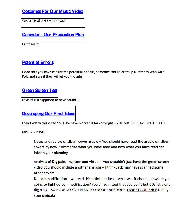
Feedback on my blog and my comments on it;
- The costumes for our music video - This post I unfortunately have not done yet but this will be the first post that i do and i will ensure to make this my main priority.
- Calendar (our production plan) - With regards to our calendar, the reason that no one else could see it is because I had the privacy on with regards to the calendars settings that meant that only the members who were linked to the calendar could see it. However now I have changed it so that anyone can see it.
- Potential errors - there was not a lot wrong with my potential errors post but now I am going to add on a part about how someone should draft up a letter to send to Woolwich Polytechnic asking them for permission so that we can get access to the school.
- Green Screen Test - there is no problems with this post in fact it was a great success, however the reason why the sound is not on it was because the sound went wrong within the clip so we decided to remove it, we however know that this problem will not occur within our actual music video.
- Developing Our Ideas - the reason that the video within this post did not work was because we added the song to the back ground of the clip and so Youtube rightly decided that this was Copyright of the song 'One More Time' and so we will have to re-upload the footage without the song in the background.
- Other Missing Posts - these are the other missing posts that i need to go back and add to my blog, these include; Notes and review of album cover article, analysis of digipacks and the de-commodification
Subscribe to:
Posts (Atom)